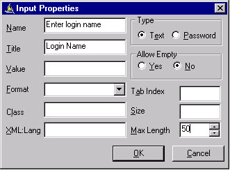
The Input element specifies a text entry object. Input can be inserted both from the Design and Code View. While inserting an Input from the Code View or by right clicking on the Input control from the Design View, will enable a properties dialog box, whereby the Input properties can be set.
|
Property |
Description |
|
Name |
The name attribute specifies the name of the variable to set with the result of the user's text input. |
|
Title |
This attribute specifies title for this Control, and this will be displayed on the screen. |
|
Value |
This attribute indicates the default value of the variable named in the name attribute. When the element is displayed and the variable named in the name attribute is not set, the name variable is assigned the value specified in the value attribute. |
|
Format |
This attribute specifies an input mask for user input entries. |
|
Class |
The attribute class affiliates an element with one or more classes. Multiple elements can give the same class name. |
|
xml:lang |
This attribute specifies the natural or formal language of an element. |
|
Type Text |
A text entry control. User agents should echo the input in a manner appropriate to the user agent and the input mask. If the submitted value conforms to an existing input mask, the user agent must store that input unaltered and in its entirety in the variable named in the name attribute. |
|
Type-Password |
The attribute is a text entry control. Input of each character should be echoed in an obscured or illegible form in a manner specified by the user agent. |
|
Tab Index |
This attribute specifies the tabbing position of the current element. The tabbing position indicates the relative order in which the elements are traversed when tabbing within a single WML card. |
|
Size |
This attribute specifies the width in characters, of the text input area. The user agent may ignore this attribute. |
|
Max Length |
This attribute specifies the maximum number of character that can be entered by the user in the text entry area. |